Sponsor Any Post or Page on the Site. Just Contact Me to Discuss.
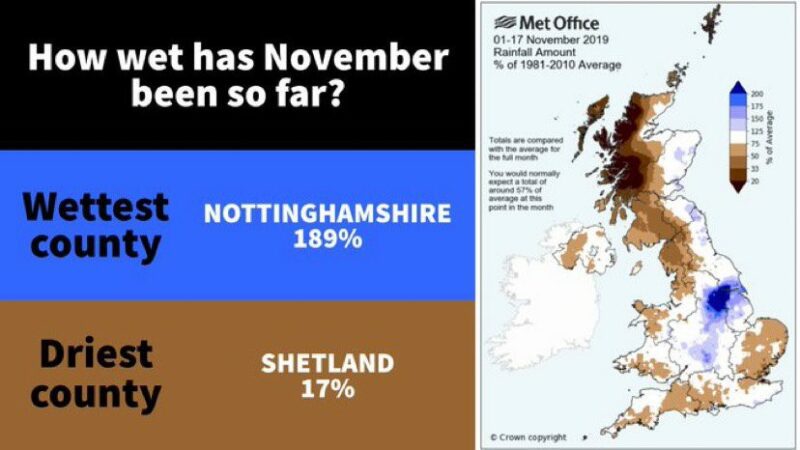
Here’s a graphic released by the Met Office, attempting to illustrate the wet weather we’ve had in the first half of November 2019.
Now, the first half of November has been pretty wet. In fact 85mm of rain has fallen on Gilesgate since the start of November, continuing the soggy 6 months we’ve had.
I looked at the map and was surprised to see that the Durham was in the white area. Usually this means ‘around average’ on Met Office maps. I checked the key and it says that white represents between 75 and 125% of average.
Now this surprised me. The mean for November in Durham is 72mm. So, I would expect the average for the first 17 days to be calculated as
(72 x 17)/30 = 41mm
So, by my calculations we’ve had 85/41 times the expected rainfall for the first 17 days. That feels about right. More than 200% of normal. Yes, it’s been wet.
Why is the graphic not showing the Durham area as Dark Blue on the map then?
Well, i’ve been having the conversation with Liam Dutton, Jen Bartram and a few others on Twitter. The graphic is showing the first 17 days of November 2019 against a whole 30 days of an average November.
What is the point? Well apparently the point is to prove that some areas have had double the rainfall in the first 17 days that November would expect in a whole month.
Does it come over that way?
My point to Liam and Jen is that I don’t think it does. It makes a great swathe of the country look average, or even below average (coloured brown) when we all know it’s been very wet. Liam points me to the small print and says this explains it all.
Isn’t the whole point of a graphic to simplify the message? To make it easy to digest the information they are attempting to put over?
We are living in an age where sadly people misinterpret things if they’re not presented properly. In my opinion, this graphic is confusing and doesn’t convey the message, which should be:
“All areas have been wet, but Nottinghamshire has been excessively wet.”
I don’t think this graphic makes that clear at all. What do you think?

Latest Editorial Posts
- Durham Miners Gala Forecast
 Sponsor Any Post or Page on the Site. Just Contact Me to Discuss. Durham Miners’ Gala 2025 Weather Forecast – Saturday 12th July “Leave the brolly at home – you …
 - New Weather Maps Page!
 Sponsor Any Post or Page on the Site. Just Contact Me to Discuss. Introducing a new page to the site. The Weather Map Page We have added the following info, …
 - Durham Live Weather Data Is Now Available
 Sponsor Any Post or Page on the Site. Just Contact Me to Discuss. The Eagle-eyed among you may have noticed a ‘Live Durham Weather’ option has appeared in the header …
 - How a Plastic Bin Fooled My Weather Station
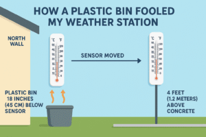 Sponsor Any Post or Page on the Site. Just Contact Me to Discuss. Sometimes, in the world of amateur meteorology, it’s not the technology that trips you up. It’s the …
 - Cathedrals, collieries, castles and coastlines
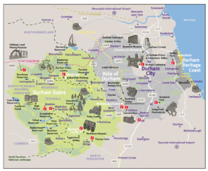 Sponsor Any Post or Page on the Site. Just Contact Me to Discuss. County Durham—my own stomping ground. It’s a place that doesn’t get nearly enough credit for its beauty, …
 - Exploring the Serene Beauty of England’s River Wear
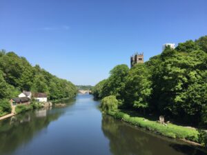 Sponsor Any Post or Page on the Site. Just Contact Me to Discuss. Exploring the Serene Beauty of England’s River Wear Nestled within the picturesque landscapes of Northeast England, between …